 Graph 1 Data & Caption | 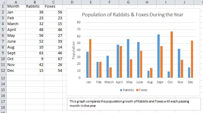 Graph 2 Data & Caption |

Graph 3 Data & Caption

Hand-Drawn Version of one of the Graphs Submitted to TA
Context:
In this tutorial, we were given three sets of data as can be
seen on the excel tables above. With a partner we were to represent that data
creating an appropriate graph (bar, line, etc.). Furthermore, after completing
the three graphs, we were to hand one of them in hand-drawn.
Reflection
_______________
This activity helped us to apply
what we learned in lecture on the topic of selecting the appropriate graphs for
different data sets. The best graph for a set of data is the one that delivers
the information with most clarity. We were also able to make sure we had every
part of the graph included such as the axis labels as well as appropriate
title, caption, and scale. On Excel, scaling is done automatically, whereas on
hand, we had to make sure it was mathematically correct and spaced out to allow
for a visually appealing finish. This is an important skill to have as graphics
and figures are what drive a technical report home, and if they are poorly
done, they prove to be ineffective.